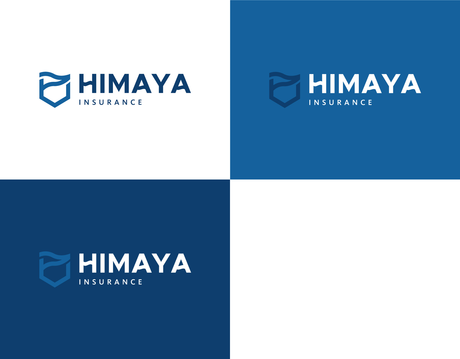
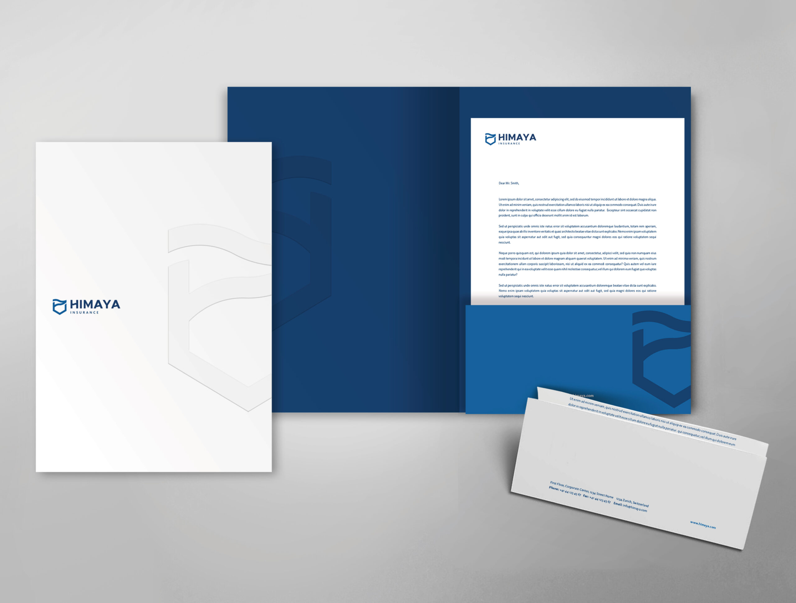
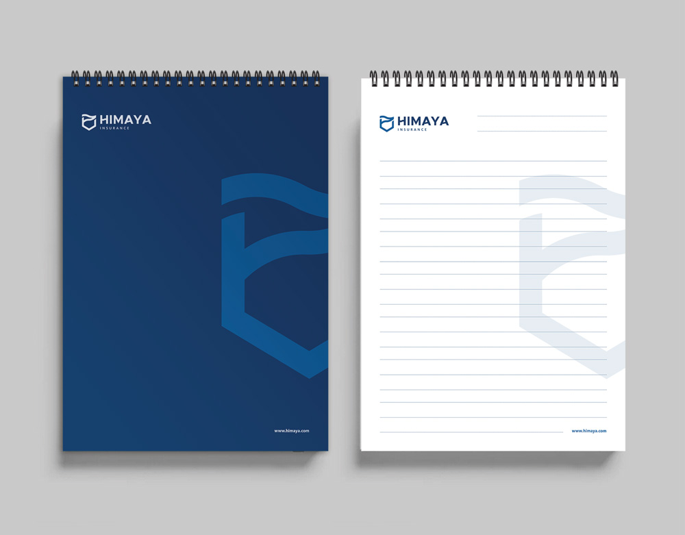
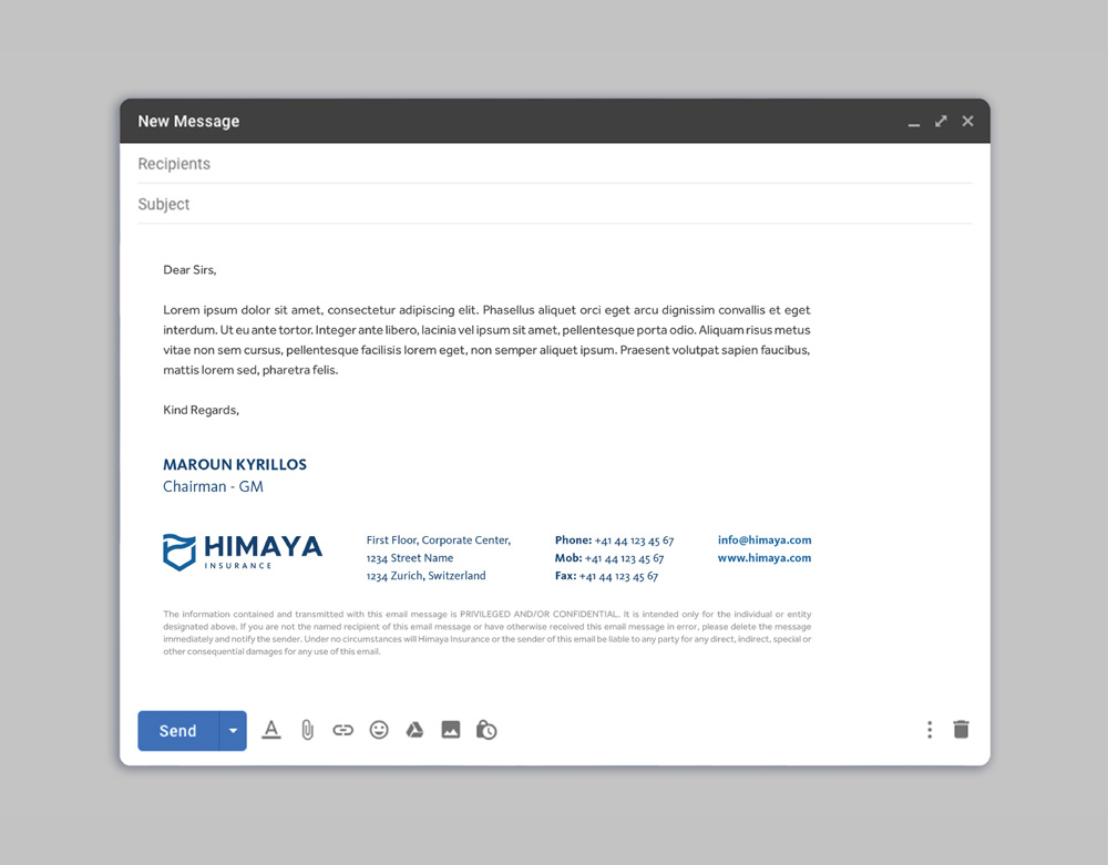
Himaya is an international insurance company based in Switzerland, with sister companies located in Lebanon and Iraq. The visual identity we have crafted for the company in Iraq metaphorically translates the concept of insurance into the world of sailing, without restricting Himaya’s activities solely to the nautical sphere. Instead, it draws a parallel with the safety and protection that Himaya offers its clients, ensuring smooth and risk-free cruising, regardless of their line of business.
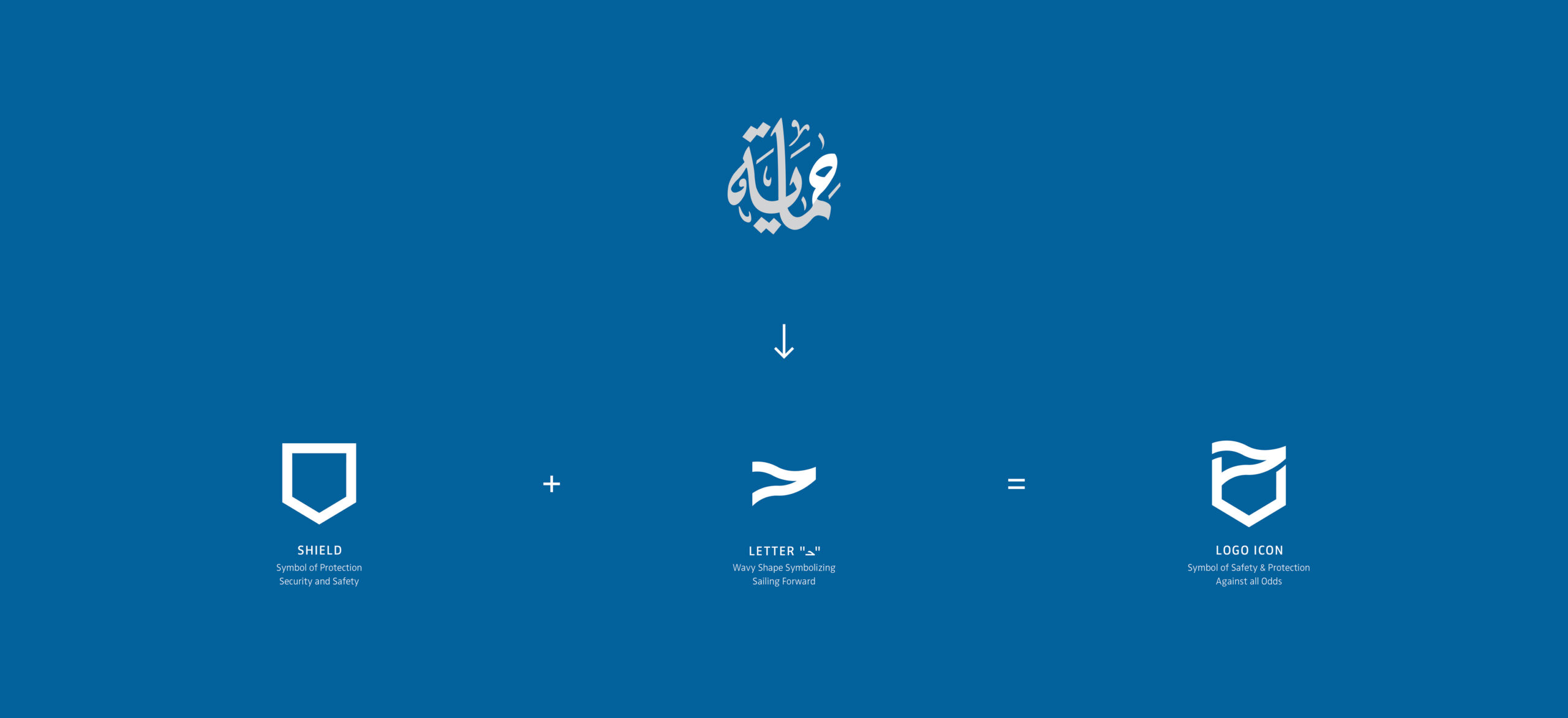
This concept is exemplified in the proposed logo design, which conveys a sense of security while also reflecting forward momentum—the ultimate goal for every client and business. In addition, the logo design pays homage to the original Himaya calligraphic Arabic logo, where the letter “ح’” is stylized and is seamlessly integrated into the contemporary icon. Simultaneously, the corporate identity we have developed is both minimal and classic, highlighting the professional and mature reputation of the Himaya brand.
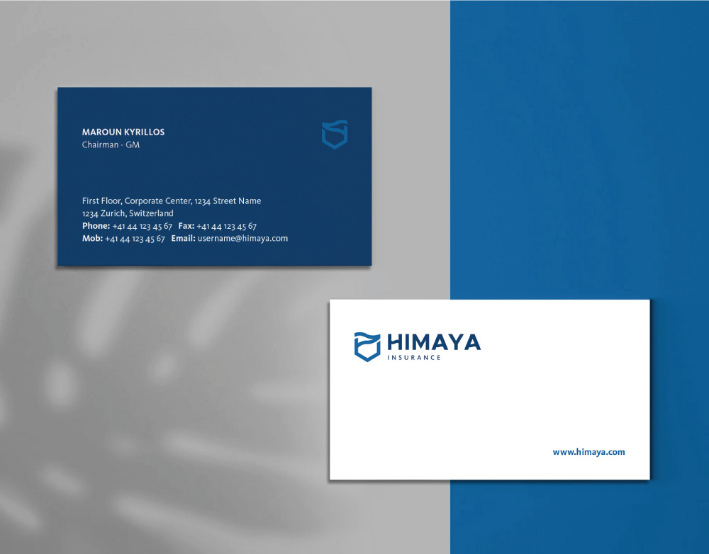
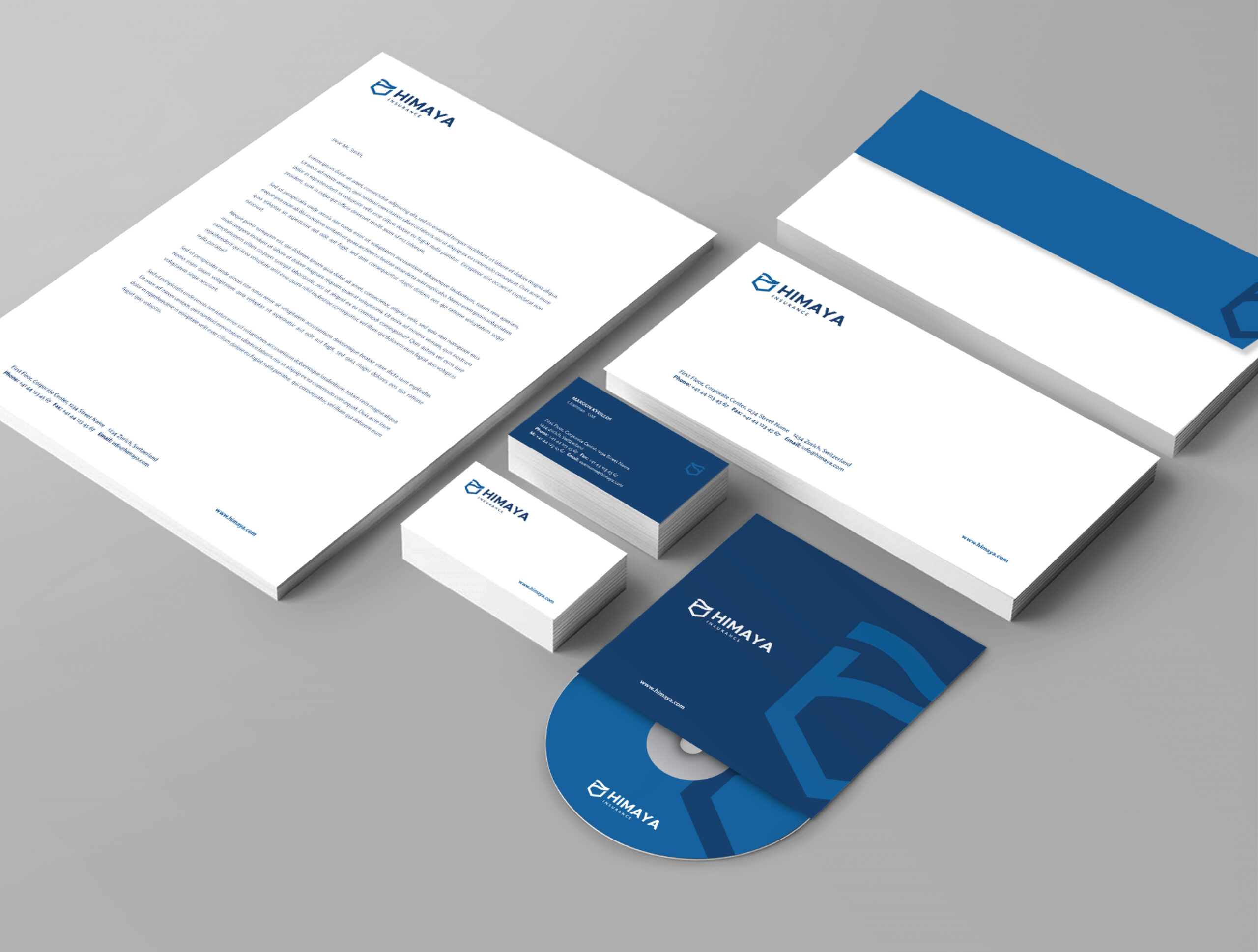
The result is a simple and straightforward identity representing a company with a strong and solid background, offering expertise in the fields of insurance, reinsurance and brokerage.
