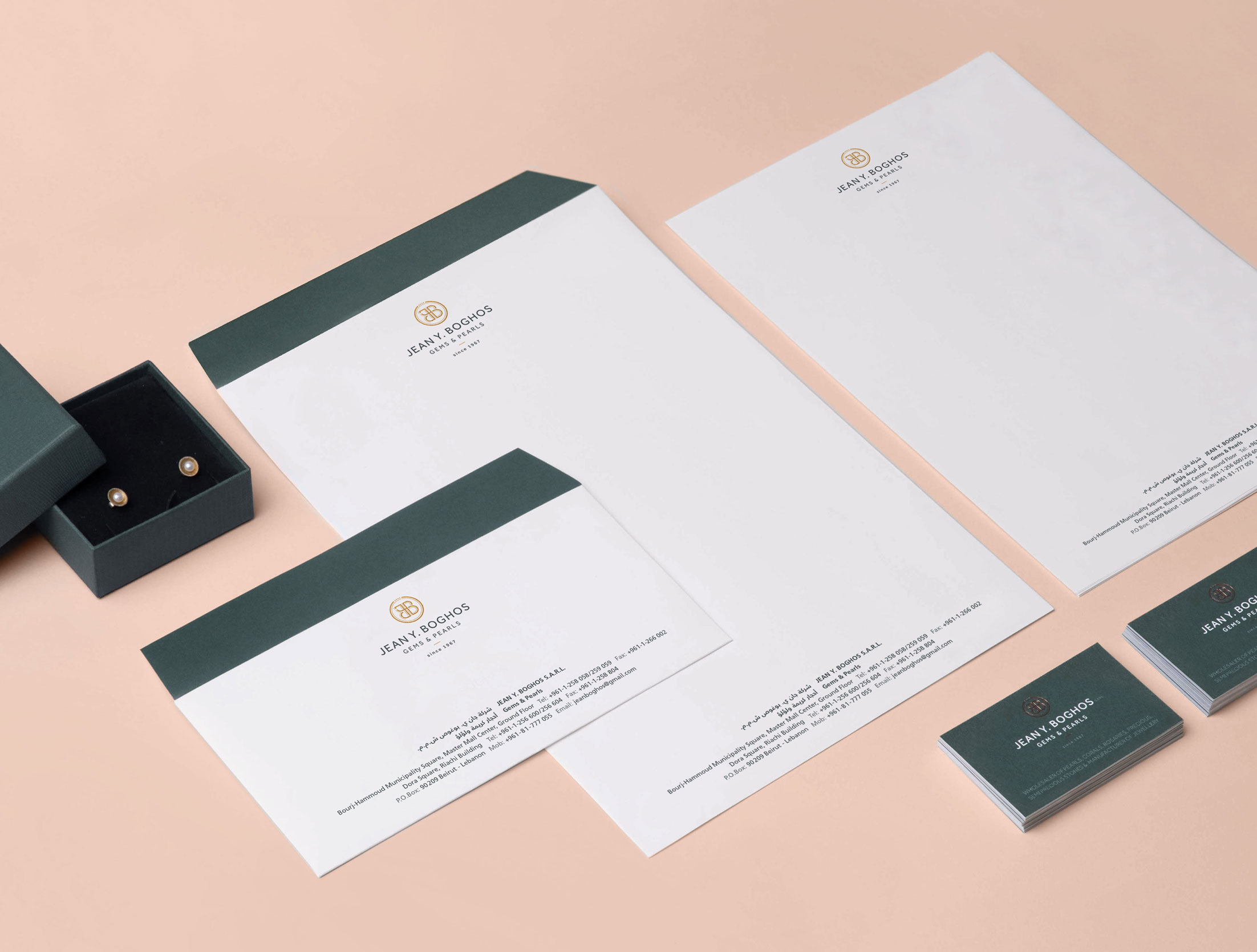
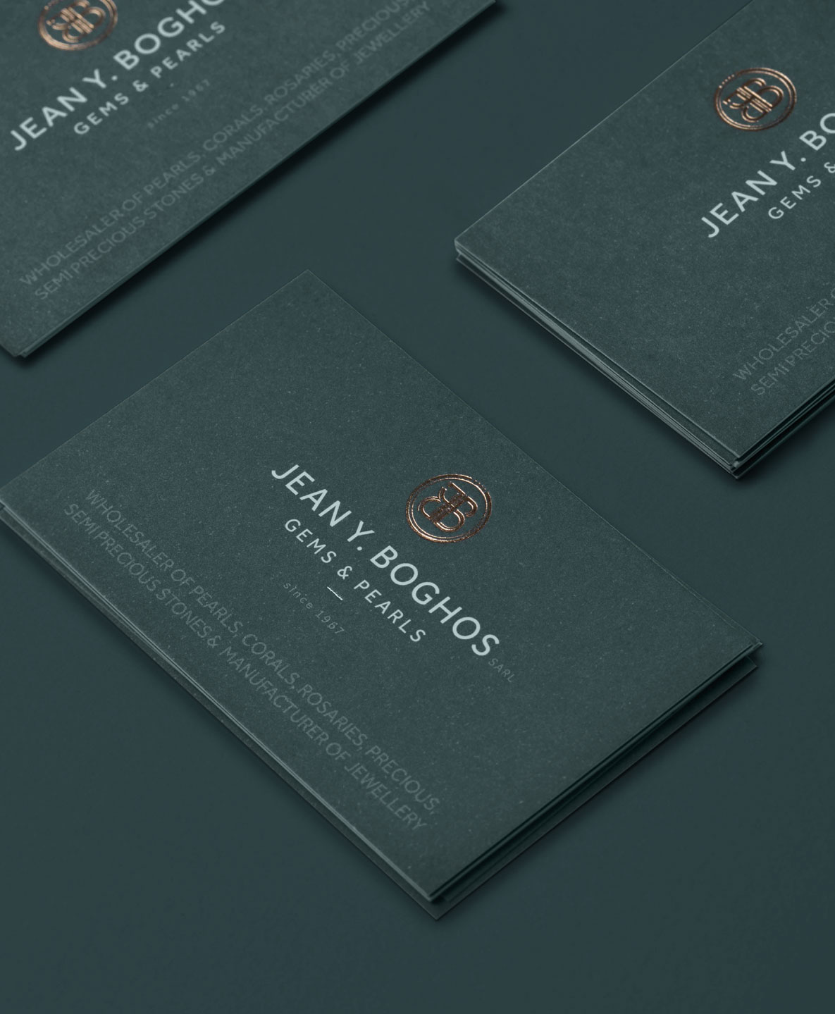
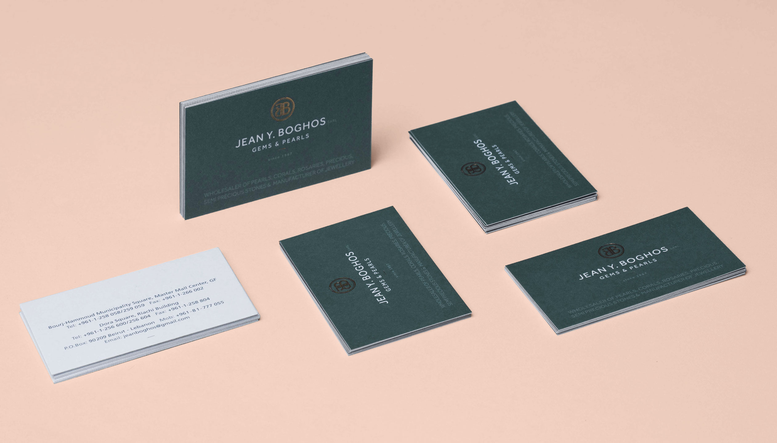
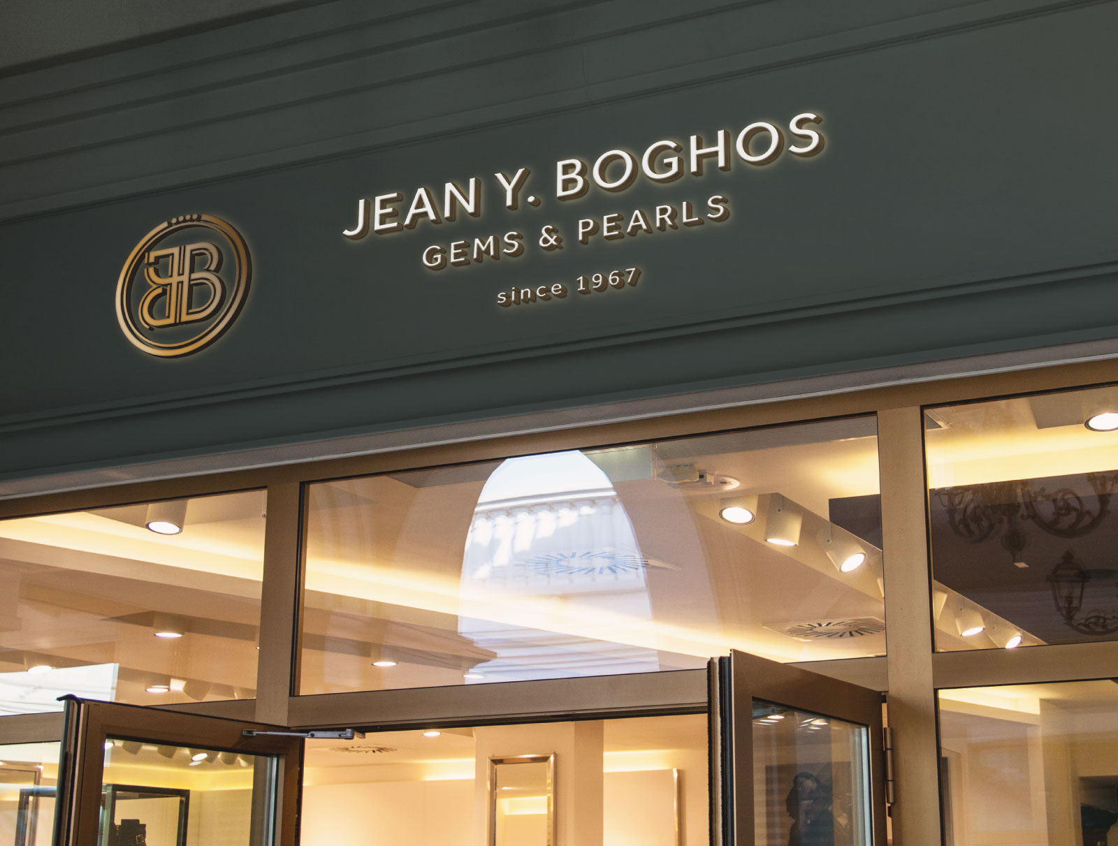
Jean Y. Boghos is a renowned jewelry wholesale business established in 1967 and specialized in pearls, corals, rosaries, precious and semi-precious stones. Creative Punch was asked to develop the full brand identity to reflect the store’s signature creations and exceptional know-how in providing premium, top-quality jewelry pieces with extensive experience and a strong presence in the market.
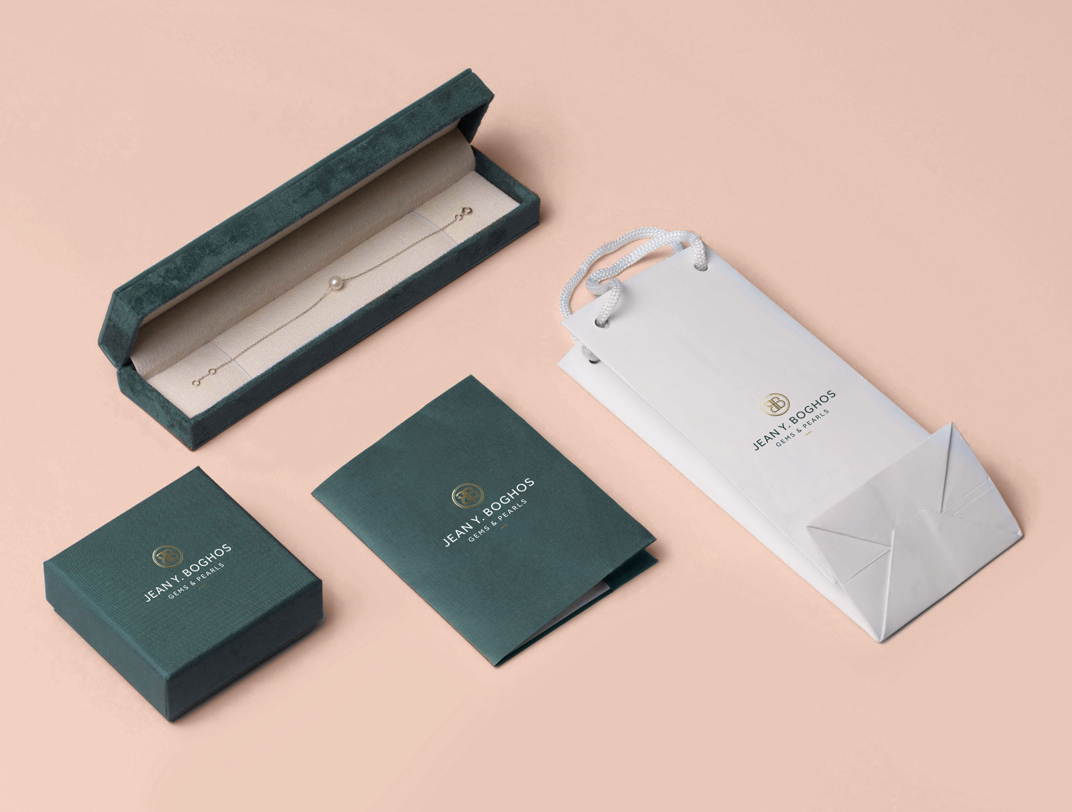
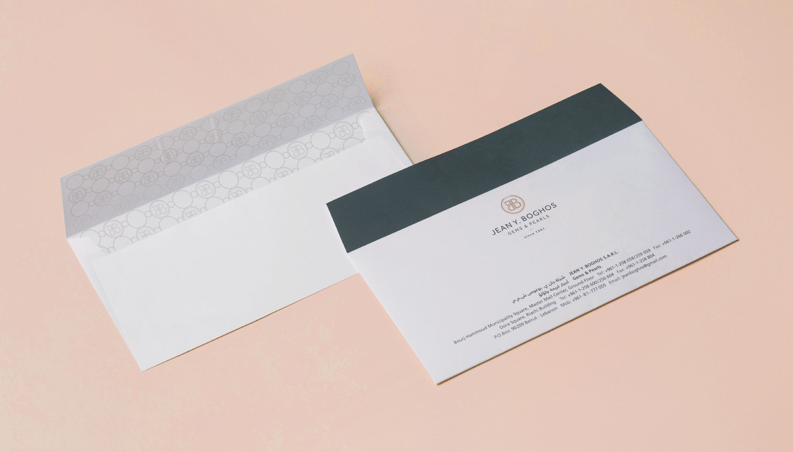
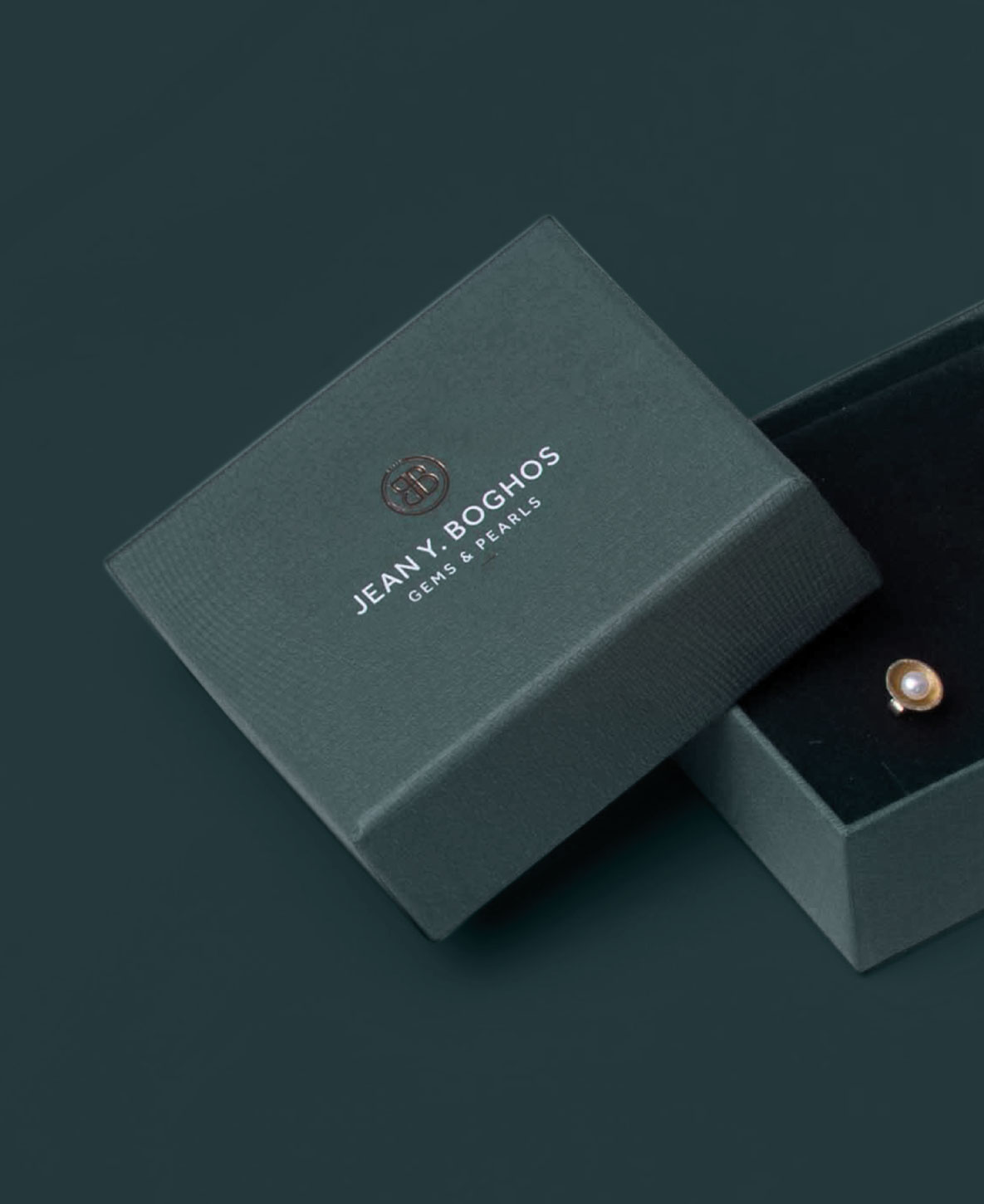
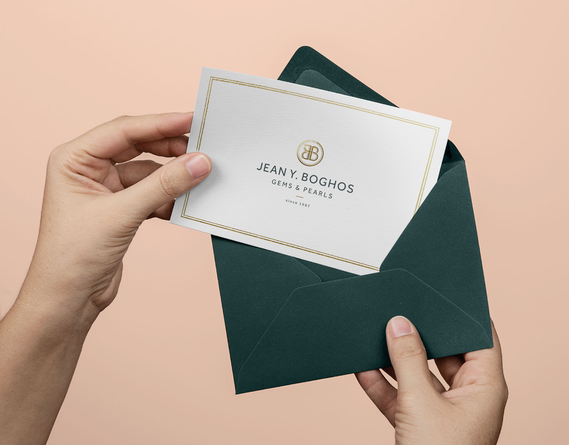
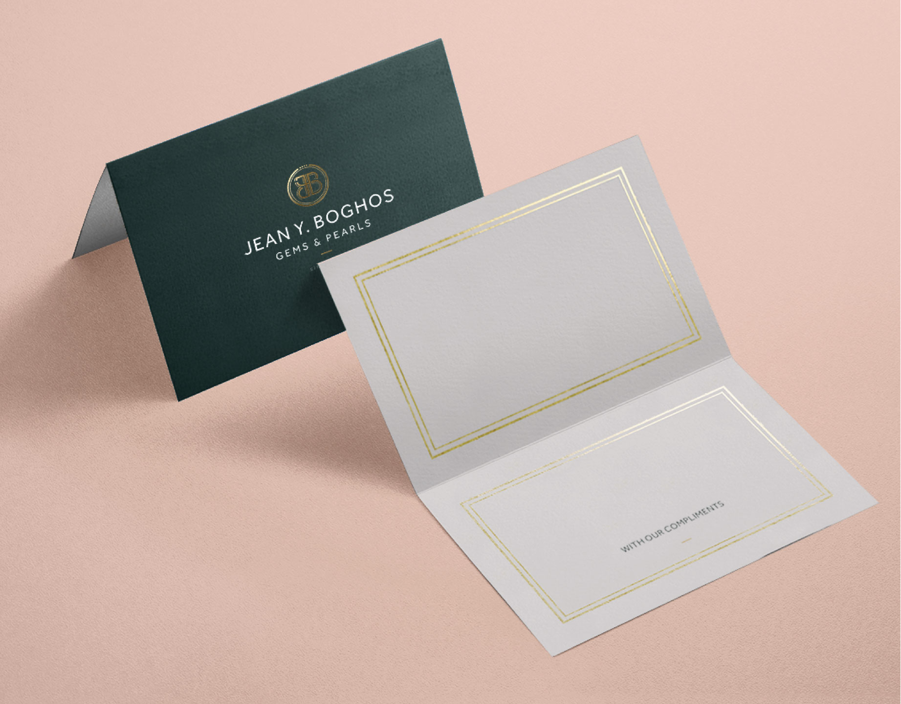
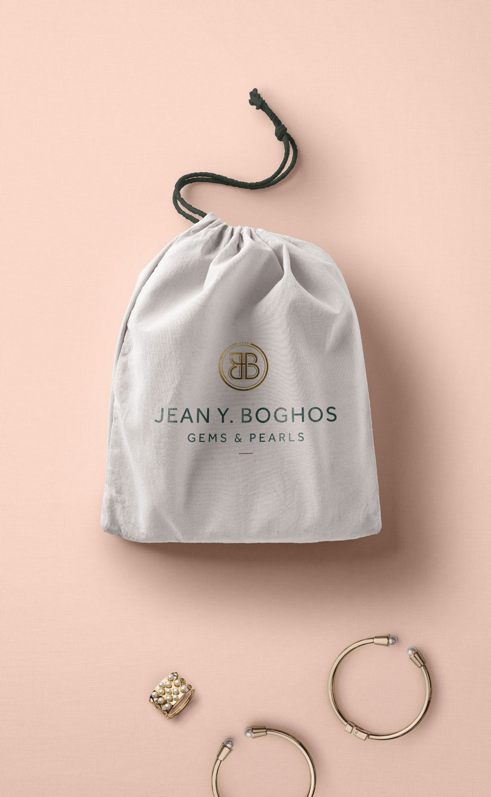
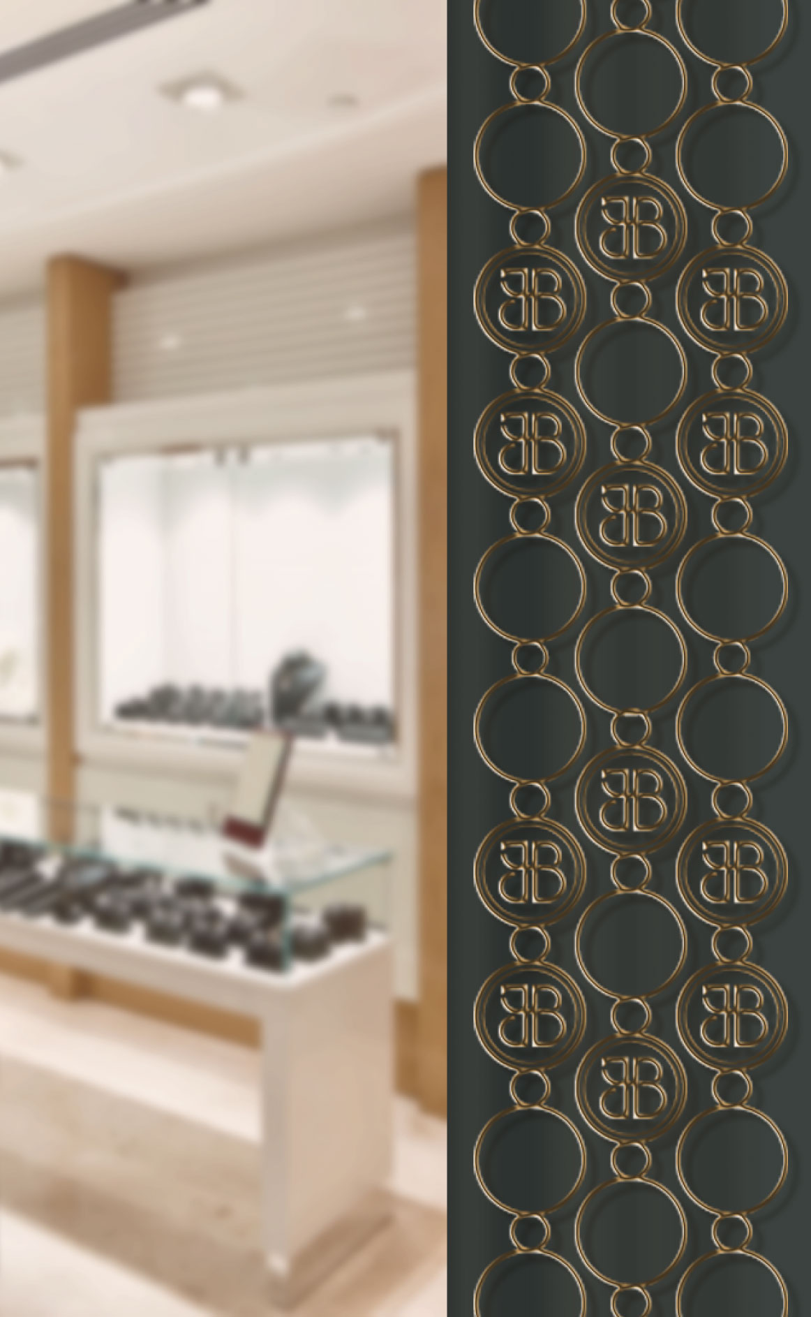
We drew our inspiration from the refined elegance of precious stones, gems and pearls to develop a brand identity that captures the stones natural beauty and finesse with its minimal graphical language and elements. The logo is directly derived from the initials of Jean Y. Boghos, whereby the letters J,Y and B intertwine to form a sleek emblem with intricate joints and details. The contrasting color palette of a rich grey green and gold give the brand a modern, bold and trustworthy image which is both prestigious and subtle, mirroring the expertise of the artisanal craftsmanship.