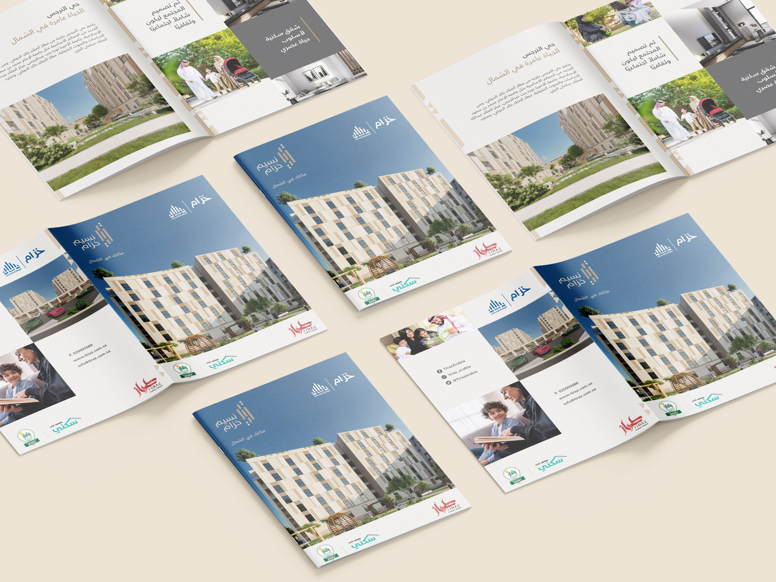
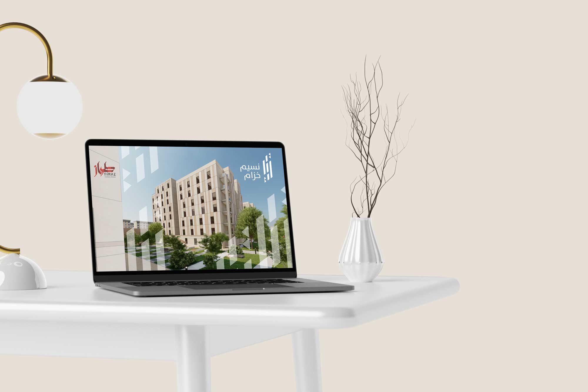
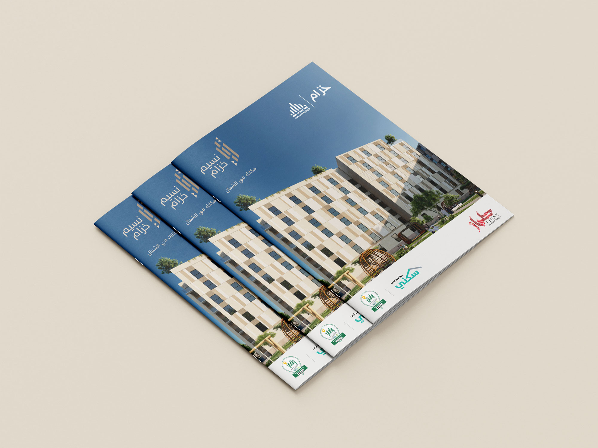
Tiraz, a prominent real estate developer based in KSA since 2010, is committed to actively contributing to the expansion and growth of the real estate sector in Saudi Arabia. They engaged Creative Punch to craft a visual identity for their latest project, “Nassim Khozam.”
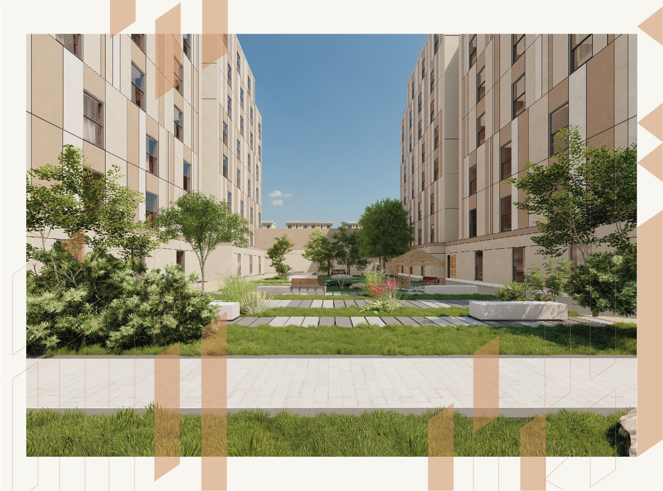
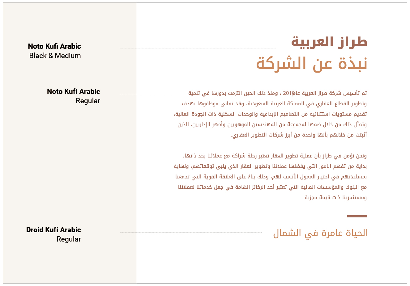
Drawing inspiration from Nassim Khozam’s architectural features, Creative Punch’s design strategy seamlessly integrates two elements. Firstly, it incorporates the traditional Salmani architectural style, characterized by detailed ornamentation, distinctive traits, and a carefully curated color palette. Secondly, it embraces the contemporary aspects of Nassim Khozam, highlighting the linear details of the facade and the refined outcomes of the overall real estate project.
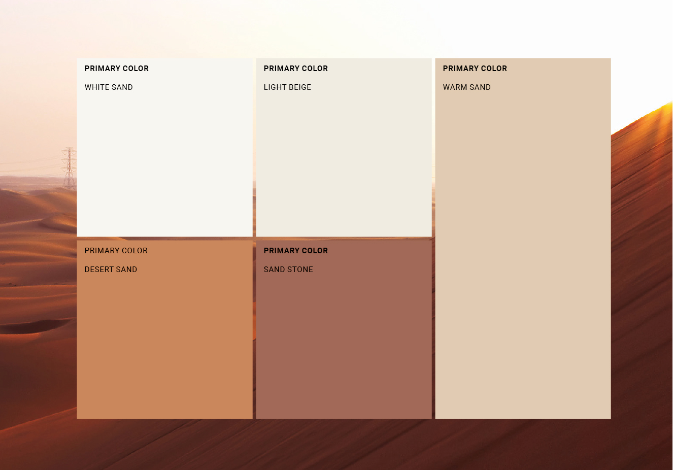
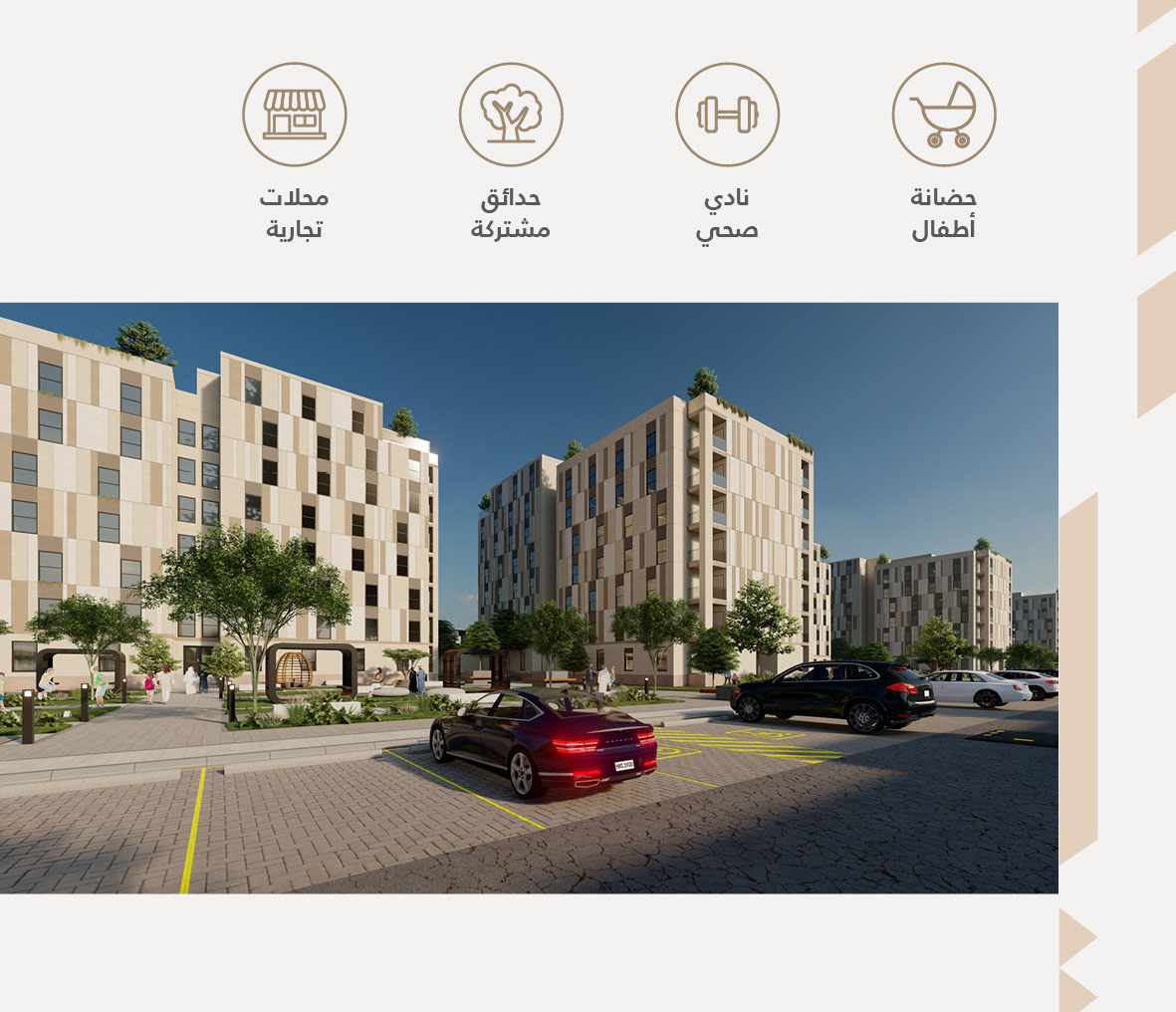
The logo, a fusion of geometric shapes inspired by Nassim Khozam’s architectural aesthetics, visually represents the vibrant community within the project. It symbolizes unity among residents and communicates the convivial essence of Nassim Khozam. To reflect the grounded and friendly atmosphere of the gated community, an earthy color palette has been thoughtfully chosen.
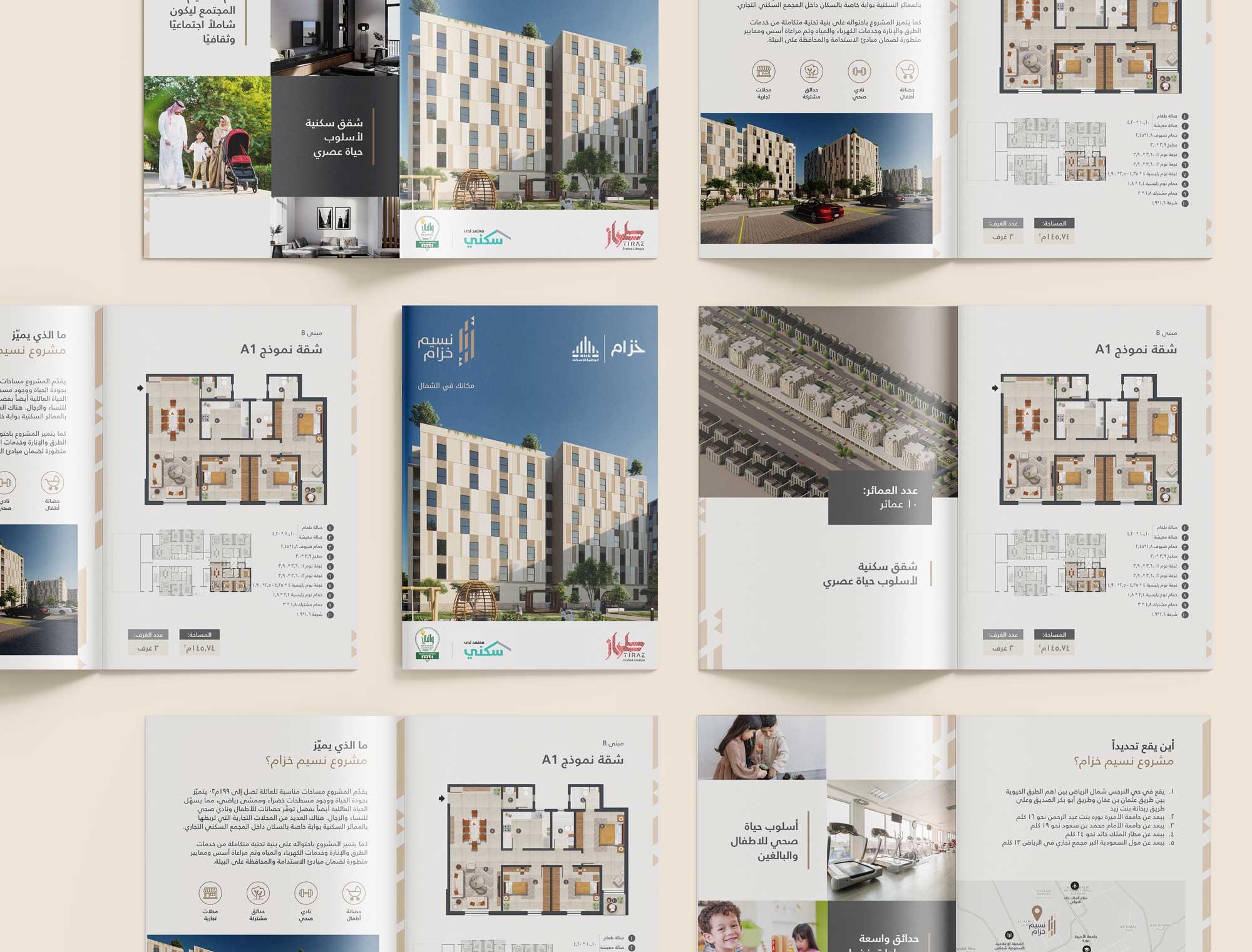
Extracted directly from the logo, graphic elements manifest as elongated linear geometric shapes strategically integrated throughout the brochure layout. This intentional fusion establishes a cohesive and visually compelling identity, characterized by a harmonious blend of modern dynamism and down-to-earth sensibilities inherent to Nassim Khozam.