Sodetel is a leading Internet and Telecom service provider, enabling banks, multinationals and various corporations to benefit from innovative telecom services and increase their efficiency and productivity. Established in 1968, Sodetel is jointly owned by the Lebanese Government and Orange. Creative Punch was asked to revamp the brand image and identity for it to be more representative of current contemporary times.
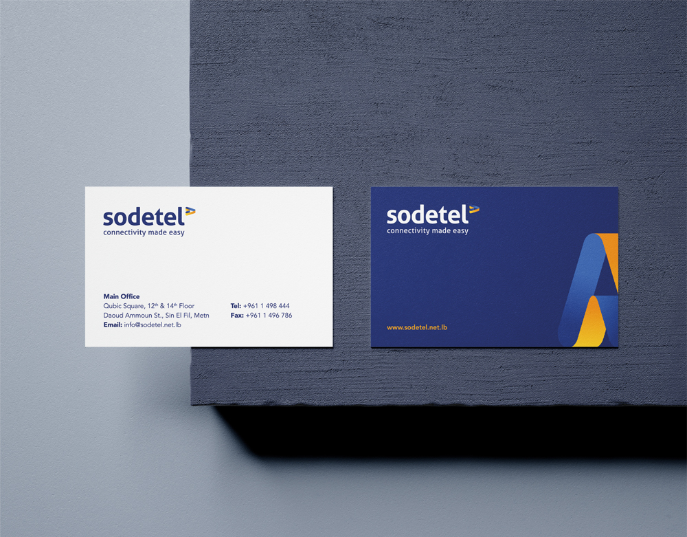
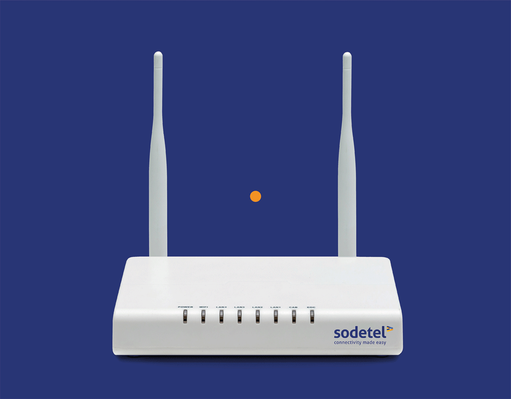
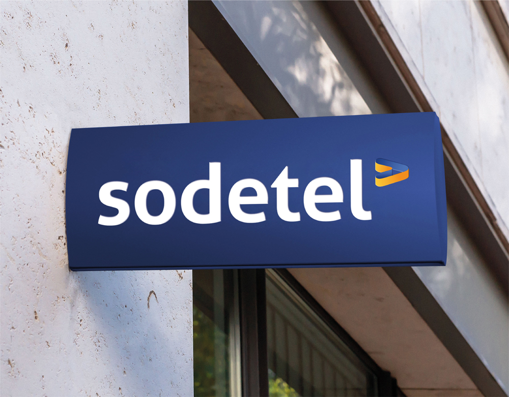
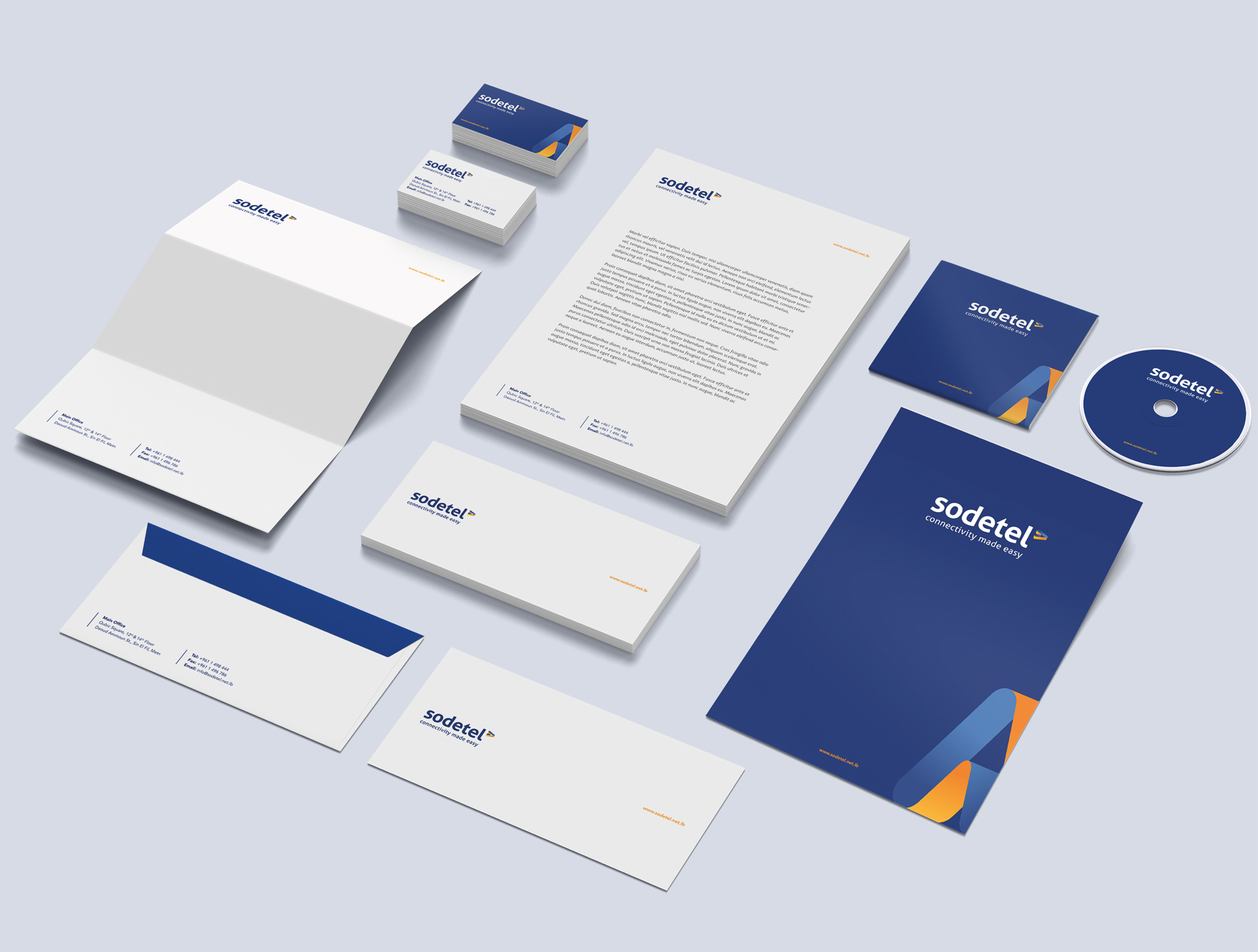
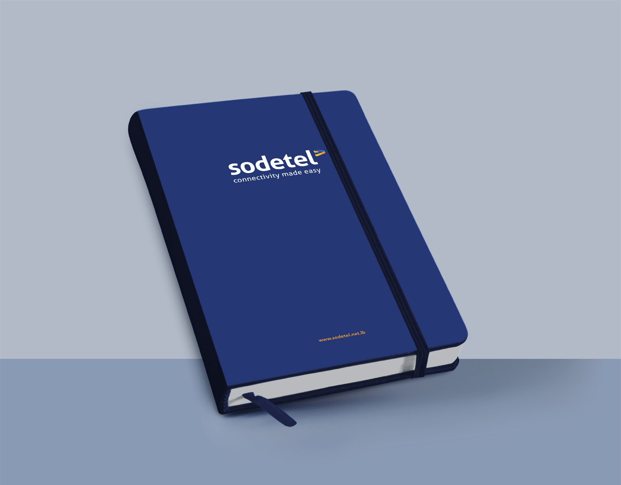
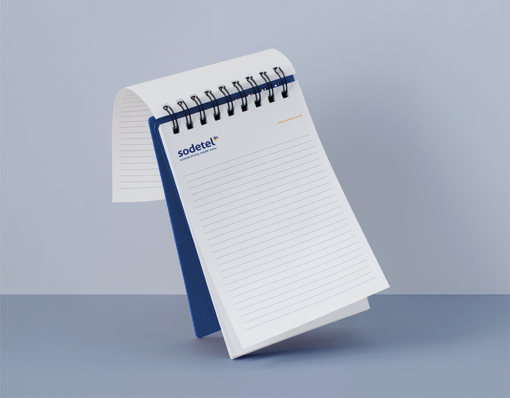
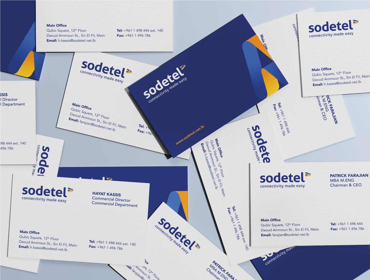
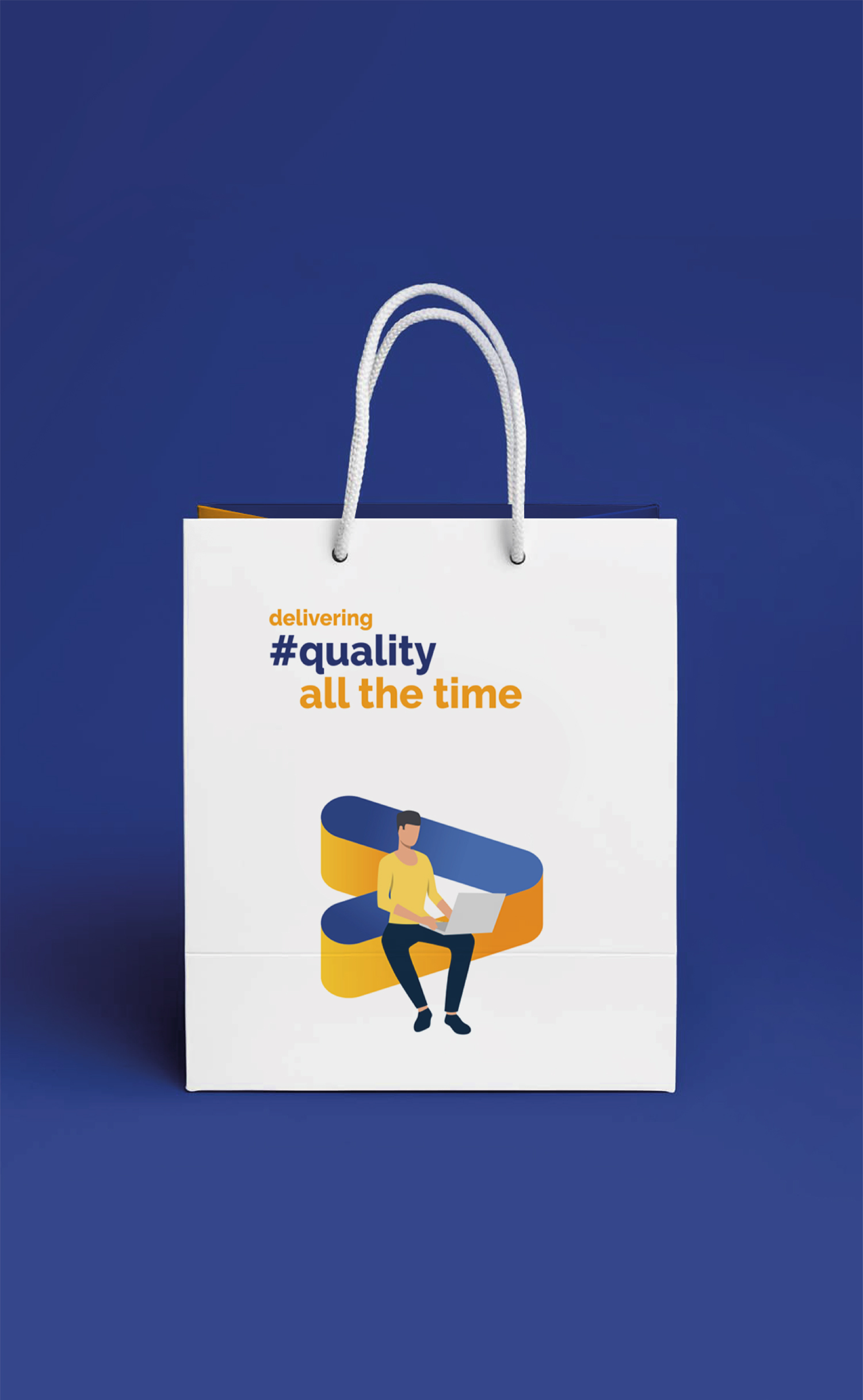
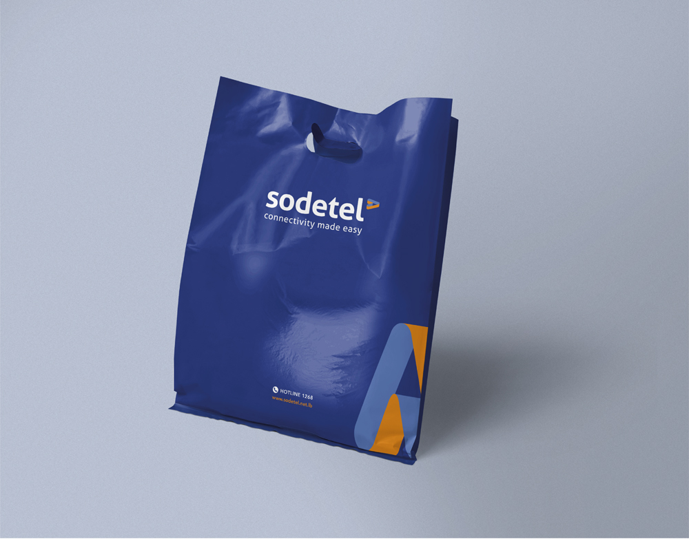
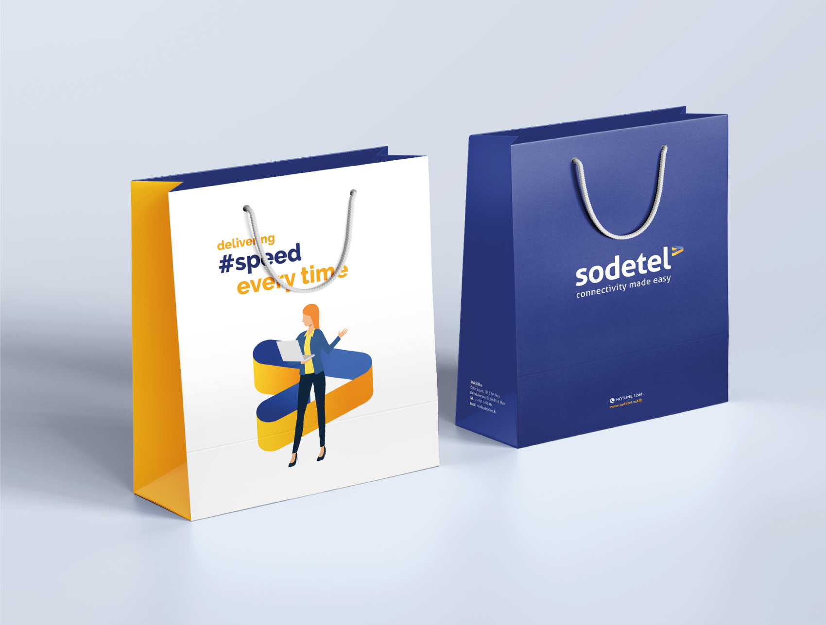
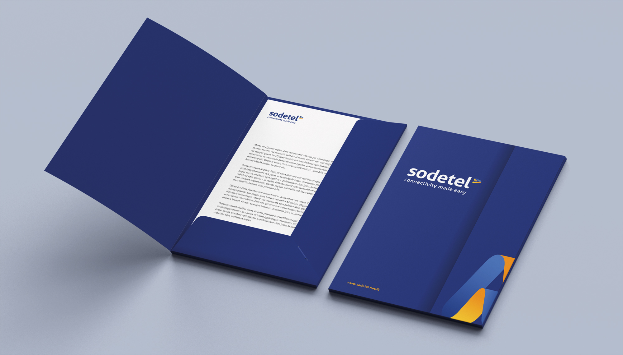
The logo was uplifted to incorporate a bold modern typeface, and an abstracted forward-moving arrow icon, focusing on speed, innovation and connectivity. The new tagline “connectivity made easy” underlines the company’s commitment and confidence in providing strong reliable internet solutions.
The visual identity was extended and interpreted throughout a rich illustration style of humans constantly connected via Sodetel. A vibrant color palette was selected consisting of an uplifted dark blue and bright orange gradient inspired from the existing recognizable brand colors of the brand. Today, the overall new brand image reflects an established business that works with an approachable high level of professionalism to better convey who Sodetel is and what it stands for in the market.